Available from FrameworX 10.1.6. |
The SparklineChart is a small trend with no axes, no labels and no legend, legible down to 80 × 20 pixels. Place it next to a KPI value or on an asset card to show the recent direction of a value. It draws as a line, an area, columns or win/loss bars.
Requirements
This component is Portable. It runs both on Windows and on Web Pages hosted on any platform.
Clients: works in the Rich Client and in the web client (HTML5), with the same values and layout on both. Verified on FrameworX 10.1.6.
Configuration
- Go to Displays / Draw.
- In the Components Panel, select Charts, then choose SparklineChart.
- Click or drag-and-drop the component into the drawing area.
- Double-click the object to open the configuration window.
Data Binding
Live mode (default): bind LinkedValue to a number, a tag or an expression. The chart keeps the newest BufferSize samples (2 to 500), one per value change. The buffer is empty when the runtime starts; a value equal to the last sample, or non-numeric, is not added.
Table mode: set UseDataTable to true and point DataSourceLink to a Dataset query or table (
@Dataset.Query.Name/@Dataset.Table.Name) or a tag that holds a DataTable (@Tag.Name). The chart draws the ValueColumn in row order (the last BufferSize numeric rows).
Behavior
SparklineType: Line (default), Area, Column or WinLoss. Bar is accepted for Column.
AutoScale (default) scales to the minimum and maximum of the drawn points (Column also includes 0). With AutoScale set to false, the fixed MinValue to MaxValue range is used and values outside it are drawn at the edge.
Markers: ShowLastMarker (default) marks the newest point; ShowMinMarker and ShowMaxMarker mark the lowest and highest points. Column and WinLoss recolor the bar instead of drawing a dot.
WinLoss: a value above WinLossThreshold is an upper bar, below it a lower bar, equal to it no bar.
Properties
Property | Description | Default |
|---|---|---|
LinkedValue | Live mode: the sampled value. | (empty) |
BufferSize | Number of points drawn, 2 to 500. | 60 |
UseDataTable | Read the points from a table instead of sampling LinkedValue. | false |
DataSourceLink | Table mode: the data source (Dataset query or table, or a DataTable tag). | (empty) |
ValueColumn | Table mode: column that holds the values. | Value |
SparklineType | Line, Area, Column or WinLoss. | Line |
LineStrokeThickness | Thickness of the line. | 1.5 |
AreaFillOpacity | Area style: opacity of the fill under the line, 0 to 1. | 0.3 |
WinLossThreshold | WinLoss style: value that splits win and loss bars. | 0 |
AutoScale | Scale to the drawn points. Set to false to use MinValue and MaxValue. | true |
MinValue | Bottom of the fixed scale (AutoScale false). | 0 |
MaxValue | Top of the fixed scale (AutoScale false). | 100 |
ShowMinMarker | Mark the lowest point. | false |
ShowMaxMarker | Mark the highest point. | false |
ShowLastMarker | Mark the newest point. | true |
Colors follow the Display theme by default: each color property has a theme slot. Set an explicit color (#AARRGGBB) only to override the theme. Color properties: LineStroke (theme accent), NegativeFill (theme red, columns below 0 and loss bars), MinMarkerFill (theme red), MaxMarkerFill (theme green) and LastMarkerFill (theme amber).
Example
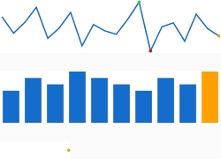
Three sparklines on a KPI card:
Table mode, SparklineType Line, with ShowMinMarker and ShowMaxMarker set to true: the highest point is marked green, the lowest red and the newest amber.
Table mode, SparklineType Column: the newest column is drawn in amber.
Live mode with a single sample (a value that has not changed since the runtime started): the chart shows one amber dot; the line grows as the value changes.
Runtime Execution
At runtime the SparklineChart adds a point on each value change (live mode) or redraws when the table changes (table mode). The image shows the three sparklines of the example in the Rich Client; the web client draws the same.