


New in FrameworX 10.1.6.
The RadarChart compares several measurements on one picture, such as the quality indicators of a product or the health indicators of a machine. Each axis shows one value on its own scale, from a minimum at the center to a maximum at the outer ring, and carries its own label. The values form a filled area. An optional reference series draws a target or a limit for each axis as an outline over that area, so the axes that miss their target stand out.
Requirements
This component is Portable. It runs both on Windows and on Web Pages hosted on any platform.
Clients: works in the Rich Client and in the web client (HTML5), with the same values and layout on both. Verified on FrameworX 10.1.6.
Configuration
- Go to Displays / Draw.
- In the Components Panel, select Charts, then choose RadarChart.
- Click or drag-and-drop the component into the drawing area.
- Double-click the object to open the configuration window.
Data Binding
Fill the Axes list, one item per axis. The axes are drawn clockwise, starting at the top.
Each axis has a Label, a LinkedValue (a number, a tag or an expression, for example
@Tag.Line1/Speed) for the value series, an optional ReferenceValue (a number, a tag or an expression) for the reference series, and a static scale given by MinValue and MaxValue.
Behavior
A value above MaxValue stops at the outer ring. A value below MinValue stops at the center.
A missing or non-numeric value is drawn at the center.
The chart redraws when the linked values change.
The chart can be placed in a Symbol. Link each axis to a symbol label (for example
#A1:) so that every instance of the symbol shows its own tags. Copying and pasting a symbol instance keeps its links.When a tag used by an axis is renamed, the axis follows the new name.
Properties
Property | Description | Default |
|---|---|---|
Axes | The list of axes (Label, LinkedValue, ReferenceValue, MinValue, MaxValue). | (empty) |
GridLevels | Number of grid rings between the center and the outer ring. | 4 |
CircularGrid | Draw the grid rings as circles instead of polygons. | false |
StartAngle | Angle, in degrees, of the first axis. At 0 the first axis points straight up. | 0 |
ShowAxisLabels | Show the axis labels. | true |
ShowMarkers | Draw markers on the points of the value series. | true |
ShowLegend | Show the legend under the chart. | false |
ValueSeriesName | Name of the value series in the legend. | Value |
ReferenceSeriesName | Name of the reference series in the legend. | Reference |
ValueFillOpacity | Opacity of the filled value area, 0 to 1. | 0.3 |
ValueStrokeThickness | Thickness of the value series outline. | 2 |
ReferenceStrokeThickness | Thickness of the reference series outline. | 2 |
LabelFontSize | Font size of the labels. | 11 |
LabelFontFamily | Font family of the labels. | Verdana |
Localize | Enable runtime text localization. | false |
Colors follow the Display theme by default: each color property has a theme slot, and the chart changes colors when the theme changes at runtime. Set an explicit color (#AARRGGBB) only to override the theme. Color properties: ValueStroke, ReferenceStroke, GridStroke and LabelForeground.
Example
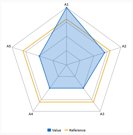
Five axes on a 0 to 100 scale, each bound to a tag, with a reference value of 80 on every axis and the legend on:
Label | Value | ReferenceValue |
|---|---|---|
A1 | 100 | 80 |
A2 | 70 | 80 |
A3 | 50 | 80 |
A4 | 50 | 80 |
A5 | 50 | 80 |
A1 reaches the outer ring and passes the reference outline; the other axes stay inside it. A value of 150 on A1 would draw the same picture, because the value stops at the outer ring.
Runtime Execution
At runtime the RadarChart redraws when the values change. The image shows the example above in the Rich Client; the web client draws the same chart.
In this section...