


Available from FrameworX 10.1.6.
The HeatMapChart draws a grid of rows and columns in which the color of each cell represents a value. Use it to spot patterns at a glance, for example alarm counts by area and hour, zone temperatures over time, or quality results by line and shift. The color scale can be a gradient (low, mid, high) or a set of bands, and a legend bar shows the scale.
Requirements
This component is Portable. It runs both on Windows and on Web Pages hosted on any platform.
Clients: works in the Rich Client and in the web client (HTML5), with the same values and layout on both. Verified on FrameworX 10.1.6.
Configuration
- Go to Displays / Draw.
- In the Components Panel, select Charts, then choose HeatMapChart.
- Click or drag-and-drop the component into the drawing area.
- Double-click the object to open the configuration window.
Data Binding
Tag mode (default): fill the Cells list. Each cell has a RowLabel, a ColumnLabel and a LinkedValue (a number, a tag or an expression).
Table mode: set UseDataTable to true and point DataSourceLink to a Dataset query or table (
@Dataset.Query.Name/@Dataset.Table.Name) or a tag that holds a DataTable (@Tag.Name). RowColumn, ColumnColumn and ValueColumn name the columns that hold the row, the column and the value of each record.
Behavior
A cell without a value (missing, non-numeric, or no record) is drawn with the NoDataFill color.
At most 2,500 cells (rows × columns) are drawn. With more data, the first 2,500 cells in input order are drawn and the CellLimitText note is shown.
With UseBands, BandThresholds such as
50;80define the band limits (N limits give N+1 bands; a value equal to a limit belongs to the band above) and BandColors lists one color per band, lowest band first.When labels do not fit, only every k-th row or column label is drawn.
At runtime, a click on a cell writes the text
row|column(the displayed labels) to the tag in SelectedItemLink. The tag is written only when its value changes.
Properties
Property | Description | Default |
|---|---|---|
Cells | Tag mode: the list of cells (RowLabel, ColumnLabel, LinkedValue). | (empty) |
UseDataTable | Read the cells from a table instead of the Cells list. | false |
DataSourceLink | Table mode: the data source (Dataset query or table, or a DataTable tag). | (empty) |
RowColumn | Table mode: column that holds the row of each record. | Row |
ColumnColumn | Table mode: column that holds the column of each record. | Column |
ValueColumn | Table mode: column that holds the value of each record. | Value |
MinValue / MaxValue | Values at the low and high ends of the color scale. When not set, the scale follows the data. | (not set) |
UseMidColor | Gradient through MidFill in the middle of the scale (low → mid → high). | true |
UseBands | Use a banded color scale (BandThresholds and BandColors) instead of the gradient. | false |
BandThresholds | Semicolon-separated band limits, with "." as decimal separator, for example | (empty) |
BandColors | Semicolon-separated band colors (#RRGGBB or #AARRGGBB), lowest band first. A missing entry uses the gradient color. | (empty) |
ShowValues | Show the value inside each cell. | false |
ValueFormat | Format of the cell values. | 0.## |
ShowRowLabels | Show the row labels at the left of the grid. | true |
ShowColumnLabels | Show the column labels under the grid. | true |
ShowLegend | Show the legend bar with the color scale. | true |
ShowToolTips | Show tooltips on the cells. | true |
CellSpacing | Space between cells, in pixels. | 1 |
LabelFontSize | Font size of the labels. | 11 |
LabelFontFamily | Font family of the labels. | Verdana |
CellLimitText | Note shown when the data has more than 2,500 cells. | Cell limit reached (2500) |
SelectedItemLink | Optional tag that receives the clicked cell as | (empty) |
Localize | Enable runtime text localization. | false |
Colors follow the Display theme by default: each color property has a theme slot. Set an explicit color (#AARRGGBB) only to override the theme. Color properties: LowFill (theme green), MidFill (theme amber), HighFill (theme red), NoDataFill (theme disabled background) and LabelForeground.
Example
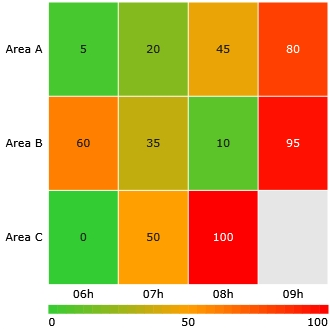
Alarm activity by area and hour. Tag mode with twelve cells, three rows (Area A, Area B, Area C) and four columns (06h to 09h), ShowValues set to true:
Row | 06h | 07h | 08h | 09h |
|---|---|---|---|---|
Area A | 5 | 20 | 45 | 80 |
Area B | 60 | 35 | 10 | 95 |
Area C | 0 | 50 | 100 | (not a number) |
The cells go from green (0) through amber (50) to red (100), the legend shows 0, 50 and 100, and the Area C / 09h cell, which has no numeric value, is drawn in the no-data grey.
Runtime Execution
At runtime the HeatMapChart redraws when the bound values or the table change, and follows the Display theme. The image shows the example above in the Rich Client; the web client draws the same grid.
In this section...